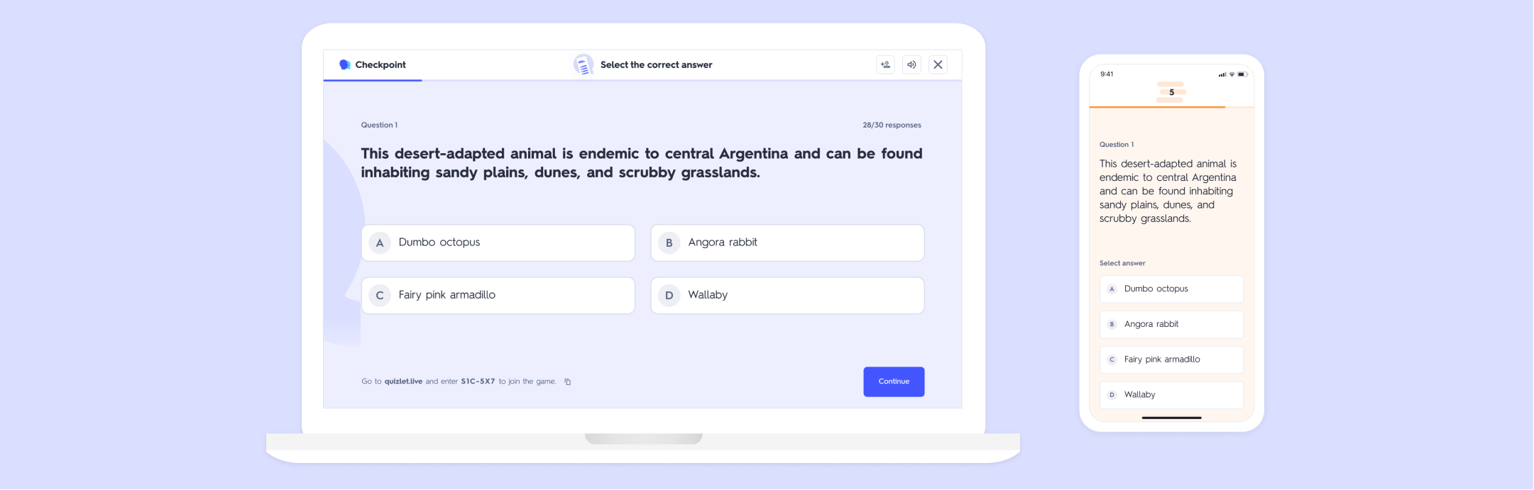
Checkpoint
Driving adoption of Quizlet’s new in-class game
A new addition to Quizlet’s web-app study game offerings, Checkpoint was developed to meet teachers’ need for fun activities that provide insight into their students’ understanding of content.
I joined the team as Lead Designer shortly after the game’s September 2021 beta launch with the goal of developing Checkpoint into a permanent, high-usage feature.
➡️ Let’s start with some high-level takeaways from this project
Challenge
Checkpoint’s usage was lower than expected with teachers only playing ~1 game per month with their students. Additionally, a high-volume of customer support requests reinforced that there were serious issues with the feature. Through discovery we identified that Checkpoint’s subpar performance was caused by early flow access and education issues paired with a boring, high-friction gameplay experience.
Solution
Make it Clear | Prominent CTA placement on the Set page, paired with a pill and coachmark draws attention to Checkpoint. A video walkthrough offers optional step-by-step guidance.
Make it Easy | A quick-start CTA allows teachers the option to jump right into gameplay without selecting specific content.

Make it Accessible | Late join capability prevents students from getting left behind while providing teachers necessary security controls. Adding animations to the header to increased accessibility and delight.


Make it Fun | A leaderboard with colorful avatars after every question motivates students who love competition. Timing optimizations like auto-advance and permanent ‘Continue’ button keep the game moving. A challenge round with more difficult written-response question types to adds engaging variety.


Outcome
Checkpoint is teachers’ go-to tool for fun and fast formative assessment on Quizlet.
+40% increase in usage - teachers now play an average of 2.2 games of Checkpoint per month
+58% increase in Checkpoint’s internal Product Ops quality score
+340% increase in users trying out Checkpoint with a +58% increase in games completed
➡️ Now let’s take a closer look at the design process that drove these successful outcomes
My initial goal as lead designer was to clarify our problem space.
I structured my discovery around a few core questions:
Where are we seeing the most drop-off and friction in the current experience?
What do teachers and students enjoy about Checkpoint and what is lacking?
What motivates teachers to use ed-tech games in the classroom?
To address the first question, I partnered with our data analyst to dive deeper into Checkpoint’s dashboards.
We uncovered a low overall selection of the feature paired with substantial drop-off at the first step of game set-up (the question selection screen). To explore our theory that Checkpoint’s low usage may be a simple discoverability issue, the team launched a quick A/B test which moved Checkpoint one level up in the IA.
During the A/B test we saw an exciting increase in users selecting Checkpoint, paired with worrisome uptick in flow abandonment at the first step of set-up. We pulled the test back and reassessed.
Moving Checkpoint up in the IA definitely drew users attention, but something was causing users to not engage with what they’d discovered.

Connecting with users
To get a deeper understanding our users’ needs, I led a cycle of interviews with teachers and reviewing customer support requests. This led to us identifying that Checkpoint was struggled in both ease-of-use and fun.

Ease of Use Challenges
Not being able to add students to Checkpoint after the game starts was a classroom management nightmare.
Full screen animations displaced question content, preventing teachers from reading it aloud to their students (a necessary accommodation in many classrooms).

Lacking in Fun
Slow pacing frustrated students.
Multiple choice questions made the game repetitive and too easy.
Gameplay felt boring - students didn’t feel motivated to get top scores or improve their performance.
Analysis Impact on Design
My PM partner and I collaborated to define our problem spaces
Problem space #1: Lack of early flow Access + Education
Teachers are unlikely to try Checkpoint because the current IA makes it easy to ignore the feature entirely.
For users who do select Checkpoint, they are likely to drop off because of set-up friction and unclear value.
Problem space #2: Poor gameplay experience
Users are unlikely to play Checkpoint more than once because of pacing and accessibility issues, difficulty managing students, and lack of fun and challenge.
Solution Discovery
Once we’d aligned on the problem spaces I worked with my PM to rapidly ideate solutions - first taking time going broad before narrowing down to the most shippable high-impact solutions, outlined above. We included our team’s key decision makers throughout to make sure we were aligning on business strategy when considering our prioritization. I brought lo-fi designs to Design Crit and stakeholder meetings to get alignment and proof of concept before overly investing in hi-fi explorations.
Learnings
Alignment + prioritization
With many projects in flight at once, it was key for me to work really closely with EM and PM on prioritization. Weekly check-ins and the ongoing spreadsheet I created helped us stay aligned and track our progress.
Hand-off documentation with just the right level of detail
During the Checkpoint optimizations there was a lot of team shuffling going on for our engineers, so I was careful to create super clear JIRA tickets and design video walkthroughs so that the work could be picked up by anyone. Design QA was more important than ever during this time of transition, so I carefully tracked projects all the way through implementation.