Real Talk iOS App Redesign
Amplifying youth voices and increasing engagement with accessible and intuitive design

Project Overview | Redesign of Real Talk’s existing mobile iOS app. This case study focuses on the app’s content consumer user experience. Primary goals are to (1) increase engagement, (2) user retention and (3) lay the foundation for community building.
Role | End-to end UX Designer. Collaborated with one other designer, software engineer and Real Talk’s co-founder. My focus within the project was the home feed, detailed story view, search page and overall style guide.
Client | Real Talk App
Duration | 5-weeks (April - May 2021)

Real Talk is more than a social media platform
Real Talk’s founders first launched their iOS mobile app in 2017 with the goal of improving teen mental, emotional and behavioral health through storytelling and technology. Real Talk crowdsources authentic anonymous teen stories on topics like identity, relationships and mental health and pairs them with high-quality online resources.
Real Talk’s product model is based on:
Storytelling: amplify youth voices & reduce stigma
Community: shared experiences & peer support
Resources: access to trusted information & additional support
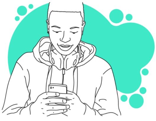
Illustration credit Real Talk App
Growing and adapting to user needs
Real Talk has not released a major product update since 2018, but since then their flagship product has reached 25,000+ global users and counting. Real Talk is preparing to implement new features in 2021, with design priorities informed by collected user pain points and the organization’s long-term vision.
Stakeholder design sprint goals:
Increase engagement with user stories and Real Talk’s trusted, teen-friendly resources
Improve user retention
Lay the foundation for features supporting community building
Table of Contents
Highlight #1: Card Pattern and Accessibility
Problem
Visual overwhelm caused by cramped UI and a color palette that doesn’t pass WCAG accessibility standards reduces engagement.
Solution
A card pattern that (1) has an accessible color palette, (2) prioritizes visual balance and hierarchy, (3) follows platform conventions.
Original Home Feed
Most color combinations fail WCAG for contrast. Story card structure lacks visual hierarchy and sufficient padding, as a result often obscuring important calls to action.

Redesigned Home Feed
Expanded, WCAG accessible color palette. Adaptive card pattern with visual hierarchy that highlights story headline and encourages user to read more.

Highlight #2: Story Microinteractions
Problem
Unfamiliar and missing microinteractions reduce engagement and don’t support community building.
Solution
Comprehensive microinteractions that mirror familiar apps to support engagement and connection.
Original Home Feed
Missing react, save and share microinteractions

Redesigned Home Feed Interactions
Intuitive react, save and share microinteractions

Original Detailed Story
Outdated react interaction, no save and share

Redesigned Detailed Story Interactions
Updated react, added save and share microinteractions

Highlight #3: Accessing Resources
Problem
Low engagement with the resources Real Talk attaches to each user story caused by: (1) low contrast call to action button with unclear affordances and (2) lack of interaction options on resource page.
Solution
Increase traffic to resources using a high-contrast call to action with explicit affordances (straightforward text and icons). Encourage engagement through a resource screen interaction bar.
Original Resource Call to Action
Weak button affordances confuses users.

Redesigned Call to Action
Larger, high contrast button with clear text and icons.

Original Resource Screen
No option to save, share or react to resource within the app. Upper navigation makes tab bar redundant.

Redesigned Resource Screen
Interaction bar replaces tab bar. Users can save resource to profile, share with others, or react.

Initial Discovery
Discovery phase included understanding client goals, consolidating research, defining our scope and uncovering existing IA.
Understanding Client Goals
Gaining insight into the Real Talk product road map
To kick-off our design sprint we met with Cristina Leos, co-founder and CEO of the Real Talk app.
Since the app’s launch in 2017, Real Talk has been combining storytelling, resources and community to support the mental, emotional and behavioral health of it’s 25,000+ global users.
In order to maximize their impact and continue to grow, Real Talk is preparing for a new feature launch which will expand their existing product.

Defining our Scope
Our initial design scope included:
Presentation of and interaction with story content and resources (my design focus).
Overall navigation and information architecture.
Creation of a user profile page.
Presentation and flow of submitting a user story (my design focus, detailed in future case study).

What is here and how is it organized?
Taking inventory of Real Talk’s Information Architecture (IA)
We decided to diagram Real Talk’s existing organization structure in order to understand all the content we would need to consider in our redesign.


To be able to assess how successful Real Talk’s existing IA was, we needed to first fully understand our users.
Understanding Users
Consolidating user data to clarify personas
Real Talk’s existing user research included three personas developed during a Fall 2020 sprint, along with a list of pain points collected from user feedback, interviews and previous usability testing.
Users can have two distinct experiences within the app, as content consumers and as content creators. While all users are content consumers, 15% of users are also content creators (meaning they anonymously submit stories to Real Talk).

User illustration credit Real Talk App
To gain insight into the home feed and story view experience, I decided to consolidate the aspects of existing user research that related to engagement with content into a single Content Consumer persona.

Amplying Youth Voices
Real Talk’s Home Feed is the heart of its storytelling model
The home feed features cards with headlines from user stories posted by Real Talk’s moderators.
The home feed’s ultimate goal is to prompt users to tap into each story’s detailed view, which showcases the entire text plus a teen-friendly digital resource.

Problem: Cramped, Inconsistent Card Layout
Unclear visual hierarchy and missing best practices reduce engagement with stories
Lack of padding and character limits causes headline text to frequently hide the “read more” call to action.
Card design doesn’t follow Nieslen’s 10 Heuristics standards for “Aesthetic and Minimalist Design” and “Consistency and Standards”.
Lack of visual hierarchy makes it hard for individual story content to catch user’s attention while scrolling.

Solution: Balanced, Consistent Card Layout
Leveraging visual hierarchy and best practices to craft designs that let youth voices shine
Create a story card pattern with visual hierarchy that catches user’s attention and engages them to tap into story details.
Support clear visual hierarchy by using the design principles of contrast, balance and white space.

Follow home feed platform standards such as full bleed content layout and expansive vertical space.

Developing Visual Hierarchy
Ranking importance of information and actions from organizational and user perspective
My first step to designing an element’s visual hierarchy was to establish which user actions were most important.
To develop the priority list below, I considered both the characteristics of my persona (the Content Consumer) and Real Talk’s organizational goals.

While crafting a visual hierarchy that matched these priorities I relied heavily on platform standards, visual design principles (contrast, balance, white space, emphasis) as well as Nielsen’s “Aesthetic and Minimalist Design” heuristic.

I created story card components with flexible height and increased padding to maximize vertical screen space and allow the user to focus on one post at a time while scrolling.

With the story card structure complete, it was time to finalize a new color system in order to increase the fidelity of my designs.
Meaningful Use of Color
Vibrant colors are important to Real Talk’s brand identity
Real Talk’s original brand color palette was designed to be fun, warm and engaging for all users.
Home feed story color is based on category and provides visual interest, since Real Talk’s anonymous stories lack other common identifiers like images and usernames.

Problem: Low-Contrast
Significant accessibility issues with color contrast limit user engagement
I used Figma’s Contrast plugin to assess the app’s current accessibility.
The colors used for the “Bullying” and “Relationships” story categories fail AA WCAG accessibility for normal text (less than 24 px).

The colors used for the search bar, “Puberty” story category, as well as tab bar fail AA WCAG accessibility for all text sizes and graphics.

Solution: High-contrast, expanded brand palette
Prioritizing meaning, accessibility and branding in color selection
Story colors provide users both visual variety as well as indicate content category.
However, the original story colors need to change not only because of contrast, but also because Real Talk’s story content is more nuanced than three categories alone.
In fact, Real Talk’s product team identified that user stories were better represented by eight distinct categories.

It was important to me to preserve Real Talk’s fun and youthful brand identity through vibrant colors. With this in mind, I began to explore high-contrast colors inspired by the original brand palette.

Using Color to Support Visual Hierarchy
Creating a nuanced, accessible color palette for each story category
I designed a four color palette for each story category that supports visual hierarchy by maximizing contrast for high priority actions and info, while reducing contrast for lower priority actions and info.
Using Material Design’s Color Tool on the Accessibility setting, Coolors color shades and the Figma contrast app all allowed me to quickly generate consistent, high-contrast color palettes for each story category.


Final Results of Design System Redesign
A colorful, engaging home feed which supports both organizational and persona goals.
Visually prioritizing content categories and headlines supports the Content Consumer’s need to quickly find stories about topics that interest them. The prioritized call to action also provides the Content Consumer easy access to other teen’s experiences and trusted resources.
The new color system and visual hierarchy also supports Real Talk’s goal of increasing engagement with the detailed story view and curated resources.


Designing for Engagement
Real Talk wants teens to know that they’re not alone
Real Talks wants to increase engagement with user submitted stories and lay the foundation for future features that support community building, such as user profiles and sharing posts.
From user research, we also know that our persona, the Content Consumer, wants to be able to share interesting posts with friends and family, as well as easily re-find valuable content.

Illustration credit Real Talk App
Using emojis to communicate
Emojis provide users the opportunity to share how content resonates with them
As an anonymous platform without profiles, users can currently only react to another user’s story by selecting from a list of five emojis, each with a specific meaning attached.

Detailed view stories are displayed as a series of text bubbles, supporting Real Talk’s goal of having stories feel personal, like reading messages from a friend.
In addition to reacting to a post overall, users can react to individual text bubbles they resonate with. This feature also provides Real Talk with important data about what types of content is most relevant to their users.

Problem: Unfamiliar and Missing Microinteractions
Lack of familiar microinteractions makes users less likely to interact with stories
The app overall is missing standard microintearctions such as save and share, which is frustrating to the Content Consumer.
The single existing microinteraction is an emoji react , which is only present on the detailed story view and via a clunky interaction.

Solution: Expanded, Intuitive Microinteractions
Encourage engagement and connection with familiar interactions
Update react interaction to align with platform and visual design standards.
Add the ability to save content to a private user profile.
Since Real Talk is not currently expanding their product to include public profiles, create the ability to easily share content with users outside of the app. This feature will address the Content Consumer’s desire to share content with friends and family, as well as introduce possible future users to the app.
Reflecting on Platform Standards
Comparative research is key to creating an intuitive experience
User-generated content sites such as Twitter, Instagram, LinkedIn and TikTok all support engagement with content through options to react, comment, share and save content.
The Real Talk product team is interested in expanding the ability to comment eventually, but due to the fact that all content posted on the site is moderated to protect youth users, there is not currently capacity to include a commenting feature.

My research showed that microinteraction cues are always indicated with clear icons (occasionally paired with descriptive language) and positioned close to content.

To update the react interaction, I turned to apps that successfully provide multiple reaction options, such as LinkedIn and iMessage, for inspiration.
In these apps, multiple emojis are presented in a horizontal list of large icons, easily accessed by thumb tap or press and hold.

Initial Designs
Preparing for Usability Testing
For the mid-fi design, I added an interaction bar which included react, save and share features in both the home feed and detailed story view.
I decided to make a horizontal multiple reactions list in order to understand more about how users engage with this type of reaction.
To reduce visual clutter I also removed the complete line of emojis in the reaction count in favor of only featuring reactions that had already been added by users.


Usability Insights
Testing designs with Real Talk target-users uplifted important insights

Iterating on Designs and Increasing fidelity
Home Feed Microinteractions
The large space between react icon and reaction count in my original design didn’t leverage the design principle of proximity, in turn dividing user’s attention when trying to add a reaction during usability testing.
To address this while maintaining visual balance, I positioned the react icon on the left, immediately below the count.
I also reduced the contrast of the count emojis, since accessing the number of reactions isn’t a priority action.

I increased the fidelity of the successful horizontal interaction with larger emojis highlighted by bright brand-color touch targets.
Leveraging the heuristic of minimalist and aesthetic design, I replaced the icons for save, share and react with iOS versions from SF Symbols.

Detailed Story View Microinteractions
To maintain visual consistency, I used the same interaction bar layout and color scheme in the detailed story view.
I designed the individual text bubble microinteractions to be as intuitive as possible for iPhone users by leveraging iMessage touchpoints and patterns.
Combining reaction count and react overlays for individual text bubbles gives users all the info they need in one tap. Reduced color saturation identifies text bubble reactions left by other users.
Next Steps for Microinteractions
Re-assessing Real Talk’s emoji choices
Real Talk knows that the emojis originally chosen in 2017 are possibly out of date both in terms of the popularity of the emojis themselves, as well as the meanings associated with each symbol.
More user research is needed to determine which emojis and meanings best resonate with teens in 2021, as well as whether providing only five options is the most engaging reaction format.

“We believe stories have the power to foster connection, challenge stigma around sensitive issues, and activate youth to find and use resources they need. “
Connecting youth with essential resources
Access to trusted information is a core component of Real Talk’s product
Real Talk’s moderators pair each user story with a high-quality, teen-friendly resource that provides youth with additional information about the story’s topic.
Current analytics show that only 20% to 25% of users are actually following the resource call to action attached to each story.
One of our primary goals for this sprint is to explore and address the causes of this low engagement with resources.

Problem: Unclear Resource Call to Action
Contrast, copy and affordance issues make it less likely for users to know resources exist
A resource call to action with low-contrast colors and vague button copy confuses users.
The presence of story resources behind the call to action is less apparent due to lack of affordances (properties that make it clear how a UI element can be used).
Solution: Emphasize and Clarify Call to Action
Improve contrast, copy and affordances to increase engagement with story resource
Youth want to explore resources about topics that interest them- Real Talk now has to make it clear where they can access information within the app.
Increased contrast paired with clear affordances (such as icons and descriptive copy) will emphasize the location of resources.
Preparing Design for Usability Testing
Working with engineering to understand technical constraints
Technical constraints prevented us from designing a call to action with a thumbnail image, which is a common practice for suggested content. In Real Talk’s case, moderators link to a wide variety of external sites for story resources, not all of which have easily featured images for thumbnails.
We also learned that the original 2017 prototype included resource thumbnails, which many testers avoided during usability testing thinking they were ads.

Keeping things the same to better understand existing friction
With this information in mind, I chose to keep the resource call to action essentially the same as the original design for usability testing.
I wanted to see first hand how users reacted to the existing language and layout to uncover clear data about what was and wasn’t working with the current call to action.

Call to Action Usability Insights
The purpose of the existing call to action is opaque
When asked to find a resource related to the story they were reading, none of our testers initially used the call to action button to accomplish the task.
One tester who did end up tapping the call to action expressed that the button copy made them question whether this was the right choice.

Exploring Comparative Elements
Uplifting explicit affordances in successful calls to action
Recently, Instagram has assigned labels to posts about topics associated with dangerous misinformation (i.e. COVID-19, US elections) which connect users directly to trusted information.
The label is centered between the post image and description, effectively catching user attention while scanning.
The information icon and chevron paired with detailed description represent explicit affordances, and indicate to the user exactly where the label will take them.

Updating Call to Action and Increasing Fidelity
Incorporating explicit affordances and brand colors
I made the resource call to action’s function more transparent by adding a large right chevron and information icon.
Changing the original “See more info...” button copy to the more precise “View resources..” further clarifies the purpose of the call to action.

A full bleed label with vibrant, brand fill color draws users’ attention to the resource call to action. The label’s fill color exceeds WCAG’s AAA standard for contrast (with black text) and stands out from the surrounding story category color system.

This sprint focused not only on encouraging users to access Real Talk’s high-quality resources, but also on supporting meaningful engagement with those resources. Now that users have followed a clear call to action, what’s next?
Supporting Meaningful Engagement
Real Talk moderators carefully source each story’s high-quality, teen-friendly resource
Real Talk connects teens to trusted information by sourcing digital resources from external sites and displaying them within the Real Talk platform.
Our persona, the Content Consumer, wants to be able to engage with resources by saving and sharing valuable resources, features which are currently missing.

Problem: No Interaction Options
Inability to share or save content frustrates users and limits engagement
Currently users are limited to scrolling and basic navigation when viewing the resources displayed in the app.
Solution: Add Interaction Options to Resources
Encourage user engagement through a consistent interaction bar
Save and share interactions will make it easy for the Content Consumer to refind and send valuable content.
In addition to addressing identified user pain points, interaction options could provide Real Talk with significant analytics data about which resources most resonate with their users.
Initial Interaction Designs
Focusing on consistency and minimalism
I replaced the tab bar navigation with an interaction bar which stays fixed in place while scrolling through a resource. The back and close icons in the header remain for navigation.
To maintain in-app consistency, the reaction bar layout mirrored the reaction bar for home feed and detailed view stories, including a share, save and react features.

Usability Insights
Resource interaction bar was a success
Users were able to easily use the interaction bar to save and share resources.
Users were not disoriented by the lack of tab navigation, and quickly used the close and back buttons for navigation.
The distance between reaction icon and reaction count created some confusion, similar to the interaction bar used for story content.

Increasing Fidelity
Streamlining and balancing the resource interface
I chose white fill for the header and footer, with reduced contrast interaction cues, to minimize visual distraction from the resource content.
To further direct user focus on content, I reduced the height of both the bottom interaction bar and the navigation header to increase the vertical screen space.

Final Results of Redesign
Clear call to action directs users to a resource interface which encourages engagement
A visually prioritized resource call to action with explicit affordances makes it clear to users where and how to access valuable information.
The new resource interface supports Real Talk’s organizational goals of increasing engagement and as well as user goals of sharing and saving important content.

Optimizing Design Handoff
Detailed developer handoff page with user flows, specs and states
Since the content consumer experience has so many different interactions and fairly complex UI, I knew that it would be challenging for Real Talk’s engineer to understand my design fully from the prototype and wireframes alone.
To make the design as clear as possible, I created a thorough document with detailed user flows, specs (colors, spacing, padding, alignment, interactions) as well as states of important elements.

Respecting our client’s and future designers’ time with Figma file documentation that facilitates quick onboarding
Our final hand-off Figma file presents not only documentation of the work that we did in this sprint, but also contains insights from previous research and design sprints.
By keeping user experience research, organization goals, and historical UI all in one place, a new designer can easily orient to important project context.

Real Talk Prototype Video
Walk-through of Content Consumer experience with Real Talk app
Learning Through Critique
Making space for critique creates stronger designs
Throughout our design process, formal and informal critique helped us to unblock problems, elevate design quality and encourage consistency.
Two formal critique sessions from experienced designers uplifted valuable insights and provided our project a fresh perspective. Strategically scheduling these critiques allowed us to get feedback at key turning points in our design process.
We also bookended our design team work time with daily stand-ups to share our design thinking and receive peer feedback.
