Virtual Glovebox Mobile App Design
Eliminating the Paperwork Stress of Vehicle Ownership

Project Overview
Virtual Glovebox is a mobile app designed to reduce user stress by storing and tracking important vehicle documents and tasks. I created this project as part of five-person team participating in the 10-day Hackathon, DeveloperWeek 2021. Our team consisted of two designers and three software engineers, including myself (UX), Kara Forristall (UX), Antonio Reyes (Back-end Developer), Endia Williams (Back-end Developer) and Derek Foster (Front-end Developer).

Role
UX Designer and Researcher
Problem and Solution
“How can the world be improved if paperwork bureaucracy were eliminated?”
Immediately intrigued by this hackathon challenge question, our team turned to concrete user research to explore how paperwork bureaucracy negatively impacts people’s lives. We were able to generate a practical solution to the problems we uncovered by pairing insights from our research with rapid ideation.
The Problem
Managing vehicle documents and time sensitive tasks is stressful
It is difficult to manage the large quantity of important documents that pile up over the lifetime of a vehicle.
Time sensitive tasks, such as registration renewal and regular maintenance, all have different deadlines which are easily forgotten.

Illustration by Pablo Stanley
Our Solution
Reduce vehicle owner stress with an all in one document management and task reminder mobile app
Allow vehicle owners to store all important vehicle documents in one easily accessible place.
Automatically track time sensitive tasks (such as registration renewal) and provide users with reminder notifications paired with actionable links.

Virtual Glovebox Dashboard View
Our Process
Rapid Ideation
Creativity under time constraints
The tight timeline of the hackathon only allowed our team a few hours to determine the direction of our project.
Our team’s initial inspiration came from each of us having experienced the stress of managing vehicle paperwork in one form or another. The amount of paperwork bureaucracy that a vehicle owner has to navigate is overwhelming. Registration renewal reminders, new insurance paperwork, endless service records from multiple mechanics- in the midst of our busy lives these important papers often slip through the cracks. Many people try to cope by stuffing their vehicle documents into a chaotic glovebox.
Enter our solution: a virtual glovebox. We envisioned a mobile app that allowed vehicle owners to easily store and access important documents with just a few taps. However, to be sure we were designing the right thing, we knew that research was vital, even with the hackathon’s tight timeline.
Strategic User Research
“Designing the right thing” by building empathy with users
We chose to create a survey and share it widely in order to engage with our target users. I was responsible for creating our survey.
Since tight schedule didn’t allow for user interviews, I carefully structured every question to collect significant data that could inform our design.

My objective with the survey was to discover whether vehicle document management was a concern for users.
If so, what did they struggle with, why, and how did it impact their lives?

Impact on Design:
Mobile app allows users to quickly import and safely access documents at all times.
Prioritize access to maintenance records and registration in dashboard and navigation.

Impact on Design:
Automatically create reminders for important tasks.
Attach links to reminders that allow users to complete tasks in the moment (example: DMV site link to complete registration)
Allow users to customize their phone notification preferences for the app
Identifying Best Practices
Comparative and Competitive Research
We did comparative and competitive business research to identify best practices and understand what features a user might expect when engaging with the Virtual Glovebox app.
Vehicle Specific Apps
Geico, Vehicle Docs, Drivvo, Carfax, My insurance app
Organization Apps
Cozi, Evernote, Google docs
Best practices we incorporated into our design:
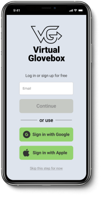
Minimize vehicle information that user has to enter when onboarding
Allow 3rd party authentication for Sign in and Sign Up
Create streamlined dashboard with only the most important tasks highlighted
Reduce visual overwhelm by nesting secondary actions within menu
Defining the MVP
Communication and collaboration between software engineers and UX designers
Defining the MVP for Virtual Glovebox was a fully collaborative process.
As UX designers Kara and I pitched features informed by research findings, while our team’s software engineers grounded us in what was technically possible.
Ultimately, we settled on a MVP that contained a user dashboard as well as flows that allowed users to:
Sign in and Sign up
Add a vehicle to the app (including registration + insurance)
Add vehicle maintenance records
View important documents in Quick ID.

Kara and I collaborated in Figma to create our MVP’s wireframes, which included an 85-screen interactive prototype.
I organized our Figma file with clear labels for each feature and flow to allow us to rapidly co-design without creating chaos.
Usability Testing Insights
Validating design decisions and discovering areas of friction
For our usability testing we wanted to see how testers actually engaged with Virtual Glovebox on a physical phone. With in person testing being limited due to COVID, we chose to test our prototype with members of our respective households using the Figma Mirror App.
We created a usability testing plan with five specific scenarios and prompts for our testers to walk through. I carefully formatted a spreadsheet with each of our scenarios and prompts so we could capture our testing data with consistency.
Successful Aspects of Our Design

Easy to Use Quick ID
Accessing documents through Quick ID was intuitive for all our testers.

Straightforward Add a Vehicle Flow
Steps for adding a vehicle felt intuitive and broken into clear sections.
Testers loved the ability to scan documents within the app as opposed to having to input all vehicle data manually.
Testers appreciated the ability to skip steps when adding a new vehicle.
Areas of Friction and Iterations

Friction with Back Navigation
Testers were confused about how to go back to a previous page when adding a new document or vehicle.
Design Iteration
Incorporated back arrows for each screen.

Friction with Button Location
Positioning of buttons was challenging for a tester who wanted to be able to engage with the app using one hand.
Design Iteration
Lowered important calls to action on screen when possible.
Deliverables
Hackathon Submission Materials
Video Demo of Virtual Glovebox Prototype Design
Reflections
Keys to Successful Remote Collaboration
Frequent communication and intentional organization
Daily communication between developers and designers through morning zoom stand ups, tandem work time and slack messages allowed us to move quickly through our design process.
I created a Trello board for our project management which allowed our team to keep track of key tasks and visualize each other’s workflow.

Trello board for Project Management
Working with Developers
Work Agile to maximize developer’s ability to build on a tight timeline
Software Engineers had a ton of back-end work to do to make our design vision a reality with the 10-day hackathon time-frame.
Defining on our MVP’s features and task flows before our wireframes were ready allowed the engineers to get started building without wasting valuable time.
Compressing our initial UX research discovery phase to just 24-hours allowed Kara and I to get our developers rough wireframes within two days.
I organized our Figma file with the developer handoff always in mind, with clear labels and frequent check-ins to understand the information our developers wanted to see.